Modernizing Rutgers University’s Design System with SDC and Storybook


Rutgers University
https://www.rutgers.edu/Drupal development
University
2025


When Rutgers decided to redesign the homepage, the goal was to modernize how it represented the university online while improving performance and usability. At the same time, the redesign offered an opportunity to address the technical debt that had accumulated over years of incremental updates, making sure the site could evolve on a solid and sustainable foundation. The new homepage needed to create a strong first impression, encourage visitors to take action, and reflect the university’s reputation for excellence. It also had to be easier to update and maintain, so the design could continue to grow alongside Rutgers’ expanding digital presence.
The Challenge
Before the redesign, the Rutgers homepage made a strong visual impression and successfully conveyed the spirit of the university, but it left room to improve how visitors interacted with it. The hero section filled the entire screen and featured an ambient background video that captured the energy of campus life, yet it included no clear next steps for users. Visitors were often drawn in by the visuals but had to scroll to find links or information that might interest them. Important content such as admissions details, academic highlights, and campus updates appeared further down the page, which reduced how often those sections were seen or clicked.
Although the design reflected Rutgers’ sense of pride and tradition, it did not fully support the growing need for a homepage that could guide users more directly. The video-driven layout also affected performance, particularly on mobile devices, and the structure made accessibility improvements more difficult to achieve.
The university wanted a homepage that preserved its strong visual identity while creating a more dynamic and action-oriented experience. The new design needed to feel distinctly Rutgers, but with better performance, improved accessibility, and a layout that encouraged engagement from the very first moment of a visit.
The Approach
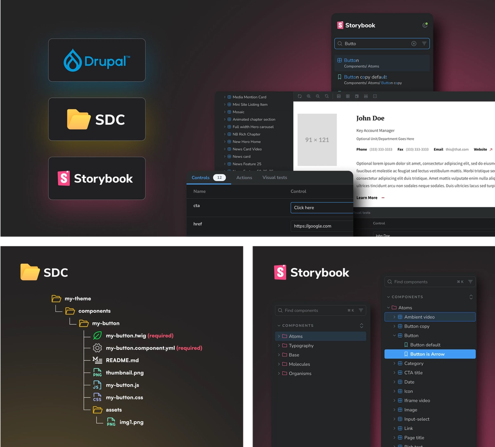
With more than 70 Rutgers websites already using a shared component library, our team proposed implementing the homepage redesign using Single Directory Components (SDC). This method keeps each component’s template, styles, scripts, and configuration in one place, allowing for cleaner development and greater consistency across all Rutgers sites. The approach also provided the flexibility to update or expand the homepage in the future without disrupting other parts of the system.


We partnered closely with Rutgers throughout the process, working with their
communications and web development teams to align design goals, technical priorities, and accessibility standards. The design work took place in Figma, where collaboration and feedback were continuous. Together, we explored layouts, refined content hierarchy, and tested interaction patterns that would make the homepage more intuitive for all audiences. Every stage of design was shaped by discussion, review, and iteration, making sure the final concept reflected both Rutgers’ brand and its commitment to usability.
To support these goals, the new homepage layout introduced a refreshed hero area designed to balance visual impact with immediate user action. Rutgers retained the option to use ambient video for storytelling, while also adopting a new static hero format tied to the “Picture Yourself at Rutgers” initiative, which highlights student life through weekly rotating photography. This approach improves accessibility and load performance while keeping the page visually engaging. Most importantly, clear calls to action were added directly within the hero space, giving visitors direct pathways to key destinations without needing to scroll, and strengthening the role of the homepage as a navigation gateway.
Our Solution
After finalizing the design, our team moved from planning to implementation, bringing the new homepage to life within the Single Directory Components framework. Building on the collaborative foundation established during the design phase, we translated each approved concept into a fully functional component developed with scalability and long-term maintainability in mind. Every element of the page was built as a self-contained unit that grouped its templates, styles, and scripts together, allowing the homepage to evolve over time while keeping its structure clean and consistent. This approach provides long-term value, since the same components are used across more than 70 Rutgers websites, allowing improvements to be made once and applied everywhere, strengthening brand consistency and reducing ongoing maintenance effort while giving the university a sustainable foundation for future updates.

As part of the work, several existing homepage components were refined and extended. The mosaic component was rebuilt to support more flexible layouts, while the news, events, and social media components were enhanced with new functionality and accessibility improvements. A descriptive links component was also extended to make navigation clearer and more intuitive, helping visitors understand where each action would take them.


Throughout development, the focus remained on speed, accessibility, and visual cohesion. Media assets were optimized, code was refined for better performance, and layouts were tested carefully across multiple devices and screen sizes. The completed homepage performs smoothly and reliably, with every element designed to be accessible, efficient, and ready to adapt to Rutgers’ future needs.
The Result
The Rutgers University homepage redesign transformed a static, video-heavy landing page into a more active, purposeful experience that now better represents the university’s character and mission. Through careful planning, collaborative design, and the use of Single Directory Components, the project introduced a structure that combines visual storytelling with measurable interaction.

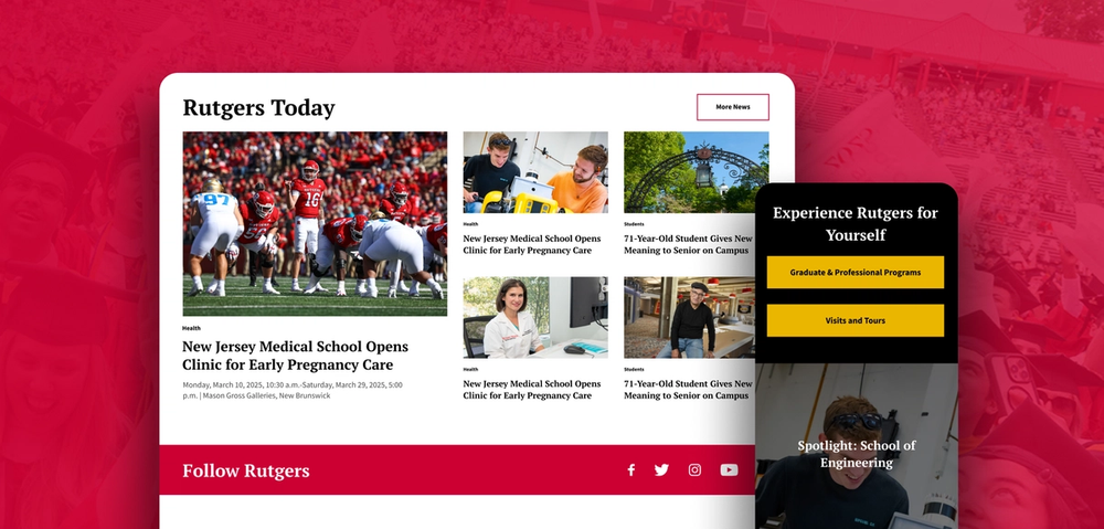
By placing clear actions at the center of the experience, the homepage now encourages exploration from the moment users arrive. The shift in behavior has been significant. Previously, key calls to action located below the hero area drew only a few hundred clicks over comparable periods, since visitors needed to scroll before seeing them. With the redesign placing new primary CTAs directly within view, engagement has increased substantially. The new CTA banner is now generating several times more interaction than before, with key pathways such as “Undergraduate Majors,” “Graduate & Professional Programs,” and “Visits & Tours” receiving four to five times the clicks seen over comparable periods before the update. The introduction of the “Picture Yourself at Rutgers” gallery has also proven successful, with a strong volume of users exploring the rotating weekly images and browsing the gallery shortly after launch.
The outcome is a homepage that reflects both the history and the modern energy of Rutgers University. It is faster, easier to maintain, and built for continued growth, an example of how thoughtful design and technical innovation can work together to create a lasting impact online.
If you’re looking to improve accessibility, boost performance, refine your design, or tackle any other digital challenge, get in touch with us to see how we can help turn your goals into measurable results.
Share
Similar projects


The Harvard OpenScholar Drupal distribution provides professional, knowledge-focused websites for universities, research institutes, and their affiliates. The task was to transform Harvard’s OpenScholar cloud-based infrastructure.


World Vision Germany chose us to enhance their digital platform based on our deep Drupal expertise and proven experience working with international NGOs. Their website plays a critical role in fundraising and donor engagement — from sponsoring children to enabling long-term online relationships between sponsors and the children they support.