ExperienceKit: Drupal Single Directory Components - What Your Pages Are Actually Made Of

Single Directory Components (SDC) are the biggest change to Drupal theming in a decade, and one of the quietest. There was no page-builder launch, no new screen to learn, just a simple answer to a question Drupal front-end developers had been asking for years: why are all the pieces that make up one part of a page scattered across five different folders?
This post is part of the ExperienceKit series. New to ExperienceKit? Start with the introduction, which the whole series builds on.
This guide covers what SDC is, why it became part of Drupal itself, how to organize a library of components on top of it, and the practical rules that keep that library healthy as a team grows it.
What Single Directory Components are
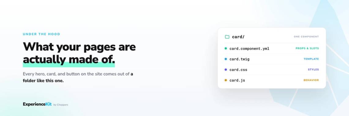
A component is a reusable building block of a page: a card, a button, a hero banner. An SDC is exactly what the name says. Everything that makes up one component, its template (the structure), its styling, its behavior, and a short description of how it works, lives together in a single folder. For example, a card component looks like this:
components/
  card/
    card.component.yml
    card.twig
    card.css
    card.js
Drupal finds the component automatically from the .component.yml file. There is no separate registration step and no extra wiring to set up. That YAML file is the component's contract: a plain-text description of what the component accepts and promises to do.
name:
Card status: stable
props:
  type: object
  properties:
  title:
    type: string
    title: Title
  variant:
    type: string
    title: Variant
    enum:
      - default
      - featured
slots:
  body:
    title: Body content
Two ideas carry most of the weight here:
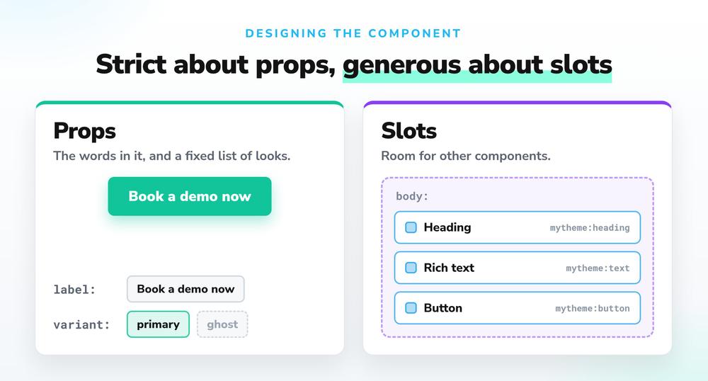
- Props are the defined inputs a component accepts: a title, an on/off switch, a choice from a fixed list of options. Each one has a declared type, and Drupal checks the input against it. If a template tries to give a card a variant that is not on the allowed list, that shows up as a clear error rather than a quietly broken style.
- Slots are open regions where you can drop in any content, the way a card body can hold whatever an editor puts there.
Rendering a component from Twig (Drupal's templating language) is a single line:
{{ include('mytheme:card', {
  title: node.label,
  variant: 'featured', },
 with_context = false) }}
Or from a render array in PHP:
$build = [
  '#type' => 'component',
  '#component' => 'mytheme:card',
  '#props' => [
    'title' => $title,
    'variant' => 'featured'
  ],
];
Same component, same contract, no matter which part of the site calls it.
The styling and behavior files come along for free. Whenever a component is shown on a page, its own CSS and JavaScript load with it automatically, with no separate bookkeeping. A page only loads the files for the components it actually uses, not the whole library. That keeps pages lean: a simple page does not carry the weight of every component in the system, which helps load times, especially for visitors on slower connections. Each component also has a unique name (for example, mytheme:card), so one theme or module can swap in its own version of a component without affecting anywhere else it is used. The inner workings can change over time while templates, layouts, and content keep pointing at the same component. That gives teams a clean, predictable way to override a component, replacing years of fiddly workarounds in Drupal theming.
Why Drupal core adopted SDC
Before SDC, a "component" in a Drupal theme was really just a habit that teams kept up by hand. The template lived in one folder, the styling in another, the behavior in a third, and the knowledge of what the template actually expected lived in a separate helper file, or in one developer's head. Several add-on approaches tried to solve this over the years and proved the demand, but each had its own way of doing things, and a library built for one rarely worked with another.
Meanwhile, the rest of the web-development world had already settled the question. React, Vue, and modern design-system tools all landed on the same basic unit: a self-contained component with a clearly defined set of inputs. Teams hiring front-end developers found Drupal's scattered-files approach was a drag. New developers had to learn where everything was hidden instead of just opening one folder and reading it.
SDC brought that shared approach into Drupal itself, which changed three things at once:
- A standard. One component format that every theme, module, and tool can rely on, instead of several competing add-on approaches.
- A contract. The
.component.ymlfile spells out a component's inputs in a form both people and software can read. Tools can check that a component is being used correctly, generate documentation, and, most importantly, let other systems understand what components exist and how to use them. - A foundation. Drupal Canvas, the visual page-building tool, is built on top of SDC. The future direction of Drupal's front end runs through SDC, so investing in an SDC library is an investment in where Drupal itself is heading, not a side bet.
That last point about a readable contract is worth dwelling on. A component that formally says "I accept a title, a variant from this list, and a body slot" can be understood by site builders, by page-building tools, and by automated systems. Anything that can read the description knows exactly what the component can and cannot do. That turns out to matter well beyond theming.
How to structure a component library
SDC tells you how to build one component. It deliberately does not tell you how to organize fifty of them. Here are the approaches that hold up in practice.
Layer the library
Three tiers cover most sites:
- Primitives: button, heading, link, badge, image. Small, simple, used everywhere.
- Patterns: card, accordion item, media-and-text, stat, quote. These combine primitives and add their own layout.
- Sections: hero, card grid, CTA banner, FAQ block, footer CTA. Full-width page sections, the kind of blocks editors and page builders think in.
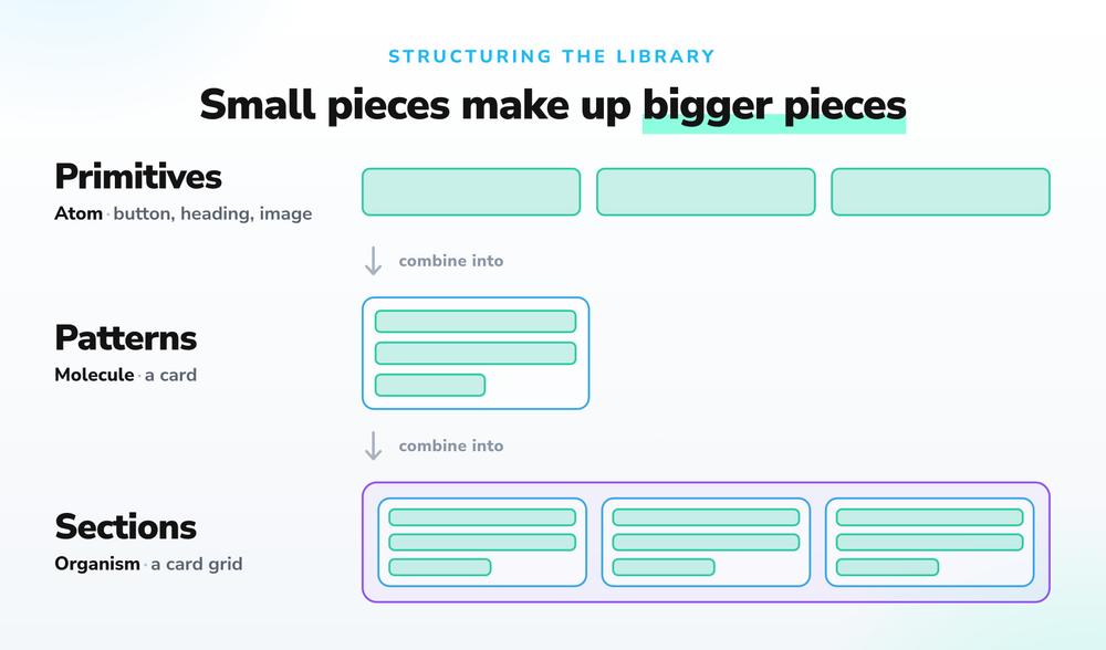
The tiers matter because different people work at different levels. Developers build with primitives and patterns; editors, landing-page tools, and page builders should mostly see sections. Naming the tiers in your folder structure (components/01-primitives/, or a group label in the YAML) keeps that structure easy to see at a glance.
If you have come across atomic design before, this is the same idea in Drupal terms: primitives are the atoms, patterns are the molecules, and sections are the organisms. You do not have to follow it to the letter. The principle behind it, small pieces composing into larger ones, is what keeps a big library understandable as it grows.
Decide where components live
- Theme components for anything visual and brand-specific: most of the library.
- Module components for working parts of the interface that need to keep working even if the site's theme is swapped out.
- For organizations running many sites (a university with dozens of faculty sites is the classic example), put the shared library in one place that every site inherits from, and let each site add to or override it on purpose, not by accident.
Be strict about props, generous about slots
Every styling choice an editor could get wrong should be a prop with a fixed list of options: which variant, how much spacing, which background. Free-form content belongs in slots. The rule of thumb: props are the controlled surface, slots are the editorial surface. A component with a free-textbackground_colorprop invites a mess of random color codes; abackgroundprop limited tolight, dark, accentbakes the design decision right into the component.
Document inside the component
The single-folder model has a nice side benefit: documentation has an obvious home. A short README.md next to the template, saying what the component is for and when not to use it, costs almost nothing and prevents the most common failure in a library: three near-identical cards built by three developers, none of whom knew the first one already existed.
Governance patterns for component libraries
A component library is a shared piece of code that a lot of people depend on: developers, designers, editors, brand owners, and accessibility owners all rely on it. (By governance, we simply mean the rules and habits that keep the library consistent and trustworthy.) The libraries that stay healthy build those rules into the process, so nobody has to police them by hand.
Treat the contract as a promise. Renaming a prop or dropping one of its options breaks every template and tool that was relying on it. Give the library version numbers, use the status field (experimental, stable, deprecated) honestly, and give any component you plan to retire a clear replacement path before you delete it.
Review components harder than pages. A bug on one page affects one page; a bug in the card component affects every card on the site. Changes to a component deserve design and accessibility review, not just a quick code check. This is also where accessibility gets cheap: check the structure, contrast, focus behavior, and keyboard support once per component, and every future use inherits that work.
Make the library visible. A component nobody can find is a component that gets rebuilt. Tools like Storybook are built for exactly this: a browsable catalog that shows each component on its own with sample content, easy for developers to work in and easy for non-developers to read when they are deciding what a page can contain. Drupal Canvas goes a step further inside the editor: it lists your components and lets editors preview one before adding it to a page. Even a simple internal gallery page does the job. What matters is that the catalog lives somewhere everyone can see it.
Control the growth rate. Every new component is something you commit to maintaining forever. A light intake rule ("show that an existing component can't do the job, then agree on the new component's inputs before building it") keeps the library a curated set rather than an ever-growing pile.
Watch the escape hatches. A design system fails not when a component is imperfect but when people go around the library: hand-built structure pasted into a rich-text field, a one-off template, output copied from an AI tool. How often people reach for those workarounds is the single most useful thing to track. It tells you which component is missing or too hard to use.
Automate what you can. Because the component contract is machine-readable, some of these checks can run automatically every time code changes: confirm each .component.yml is valid, fail the build when a template passes an input the component never declared, run accessibility checks against components filled with sample content. None of this replaces human review, but it catches the mechanical mistakes (the renamed prop, the removed option) before a person ever has to look.
Adopting SDC in an existing theme
Most teams are not starting from a blank slate; they are working with an established theme built up over years. The good news is that SDC is designed to be adopted gradually. New components and older-style templates can live side by side in the same theme for as long as you like.
A migration path that works:
- Take stock before you build. Walk through the site's main page types and list the visual patterns that keep coming up. Most Drupal sites land on a modest set: heroes, cards, media-and-text, accordions, and CTA banners cover a large share of any landing page. This exercise usually reveals the real problem: five slightly different versions of the card that should be one component with a few variants.
- Start with the most-used pattern. Turn the card (it is almost always the card) into an SDC. Define its inputs honestly, with every variant that genuinely exists and nothing that should never change, then swap in the new version one template at a time.
- Convert as you go, not all at once. Build new features as components from day one; convert old templates when you happen to be working on them anyway. A rushed all-at-once conversion produces sloppy contracts, and the contract is the part you will live with longest.
- Retire the old helper logic along the way. Each conversion moves logic out of separate helper functions and into clear inputs passed directly where the component is used. The theme gets easier to read with every component you convert, which is much of the long-term payoff.
The end goal is not to turn every template into an SDC. It is to make sure everything editors and page-building tools assemble pages from is one: the sections tier fully built as components, with a clear contract on every block a page can be made of.
SDC as the foundation for what comes next
Across the Drupal world, SDC has become the foundation for new capabilities. Drupal Canvas builds pages out of SDC components, design-system tools use the SDC contracts to understand how components are put together, and AI-driven page generation relies on the same descriptions to pick components and fill them with content. Because every component states its inputs in a form software can read, AI can assemble pages from the existing library instead of inventing page structure from scratch.
A well-run SDC library is therefore more than a theming nicety. It is the layer that decides whether the next generation of tools, human-driven or AI-driven, produces pages your organization can trust.
Where ExperienceKit fits
This is the premise ExperienceKit is built on. BrandKit is an SDC-based design system for Drupal: a governed library of accessible, production-ready Single Directory Components, built on your brand and delivered as part of the solution, and structured along the lines described above. CampaignKit is the AI layer on top. It generates production-ready Drupal landing pages from a plain-language prompt, built entirely from BrandKit's approved components. The component library defines what the AI can build. It can assemble pages from the available hero, card grid, and CTA banner components, but it cannot produce structure or layouts that aren't part of the library.
For teams that have invested in SDC, that means the component library no longer serves only developers. It becomes the thing that lets marketing generate on-brand pages in minutes while developers keep full control of what pages are made of. Pages are assembled from approved components, never made up from scratch.
Go deeper
Get in touch for the full architecture, and we will walk you through it, or book a demo to see a prompt become a page built from SDC components.
Related posts

Your marketing team needs a landing page for next month's campaign. Today that means a brief, a ticket, a spot in the developer queue, and a few weeks of waiting. ExperienceKit turns it into a sentence. Describe the page, and AI generates it in your Drupal site: production-ready, on brand, and built entirely from a governed component library, one built on your brand and delivered as part of the solution. This post introduces what ExperienceKit is, why we built it, and what the rest of this series will cover.

Describe the landing page you need in plain language. A few minutes later, it exists in your Drupal site: production-ready, on brand, and waiting for your review. That is the promise of an AI landing page generator for Drupal, and it is no longer a demo trick. It works, it is reliable enough for enterprise sites, and it changes how marketing and development teams divide their work.