Drupal User Experience - researching and how to move forward


Dries Buytaert, the creator and project lead of Drupal, wrote a blogpost, 'Turning Drupal outside-in' three months ago that caused a large stir in the Drupal community. This post was particularly interesting for us as a Drupal development shop and active members of the international Drupal community because the future of our company is largely determined by the future of Drupal. In his writing, Dries discussed how the user experience of the Drupal platform be improved and how the CMS itself can be simplified, made easier to understand and easier to use.


After his first post, Dries wrote two more, ‘Examples of how to make Drupal “outside-in' and 'Handling contect in 'outside-in', where he thoroughly examined UX-related problems and even gave suggestions about how to transform some parts of Drupal.
This is not the first initiative to target UX improvements in Drupal. But why is this topic important at all? Most of you have probably seen this funny - but valid - illustration that compares Drupal's learning curve to some other CMSs.

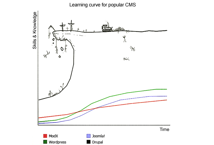
That is, to understand, manage and develop Drupal requires a lot, and as shown in the image above, many people give it up on the way. Despite Drupal being a well documented system-- there are only a few questions that you cannot find an answer to in the developer's guide-- we must state that creating the first few pages, understanding Drupal specific terminology, or finding some settings can cause a lot of headaches for a beginner.
I believe there are two reasons for it. First of all, Drupal was made by developers, by taking developers' needs into consideration (and this left some traces on the user interface as well). Second is that Drupal is also prepared to handle very complex solutions, which results in making the whole system complex.
At this year's DrupalCamp in London there was a UX session about this topic. The speakers showcased Wordpress's user experience by conducting a test. They gave a task to a friend of theirs to put together a website for a certain purpose in Wordpress and they presented the results and compared them to Drupal's out-of-the-box experience in the following discussion.. Similar to the reactions to Dries's first blogpost, a passionate debate developed between the 40-50 attendees about how this comparison is valid, what the target audience of Drupal is, and what kind of needs this target audience has. Should everything be drastically changed for the better user experience, or should it be an iterative process with smaller steps forward? I've been to many talks in the last few years, but I've never been to such a passionate one like this, and even though there was no conclusion in the end, and it became obvious that there are a lot of things to do in this area.
At that time nobody knew the answers to the questions and doubts that arose, but a few months later, half a year after releasing Drupal 8, Dries launched research about the state of Drupal. 2900 responses were submitted to this survey by content managers, developers, decision makers of smaller companies and larger enterprises, beginners and experts as well. The results were presented in his keynote at DrupalCon New Orleans.

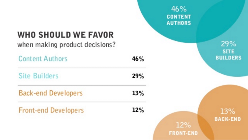
An important part of the research focused on the types of unresolved problems and which are most important for different target groups. If you are interested, you can watch the whole Driesnote and check the slides.
What can we do?
At Cheppers we've been doing graphic design for websites and services since the beginning, and we expanded our designer team with UX specialists at the beginning of 2015. Thanks to this, during the last year and a half, we got the chance to participate in UX research several times, in planning and in the realization, so I was able to closely observe how useful (furthermore, irreplaceable) UX research is when planning a website or a web service.
After Dries's first blogpost about this topic I started wondering how our UX team could take part in the process of improving Drupal's UX. After several discussions, we agreed that it would be useful to see the source of the problems and then come up with a suggestion to the solution. For this, research was definitely inevitable.
There was a similar usability test in 2015 at the Usability Lab of University of Minnesota, of which the results were presented at DrupalCon Barcelona last September, and which came with 100+ issues related to usability.
Our own research was prepared to make sure it covered the previously mentioned usability test, but it was partially simplified, and we also changed the tasks as we thought this could help us discover even more fundamental problems. We also wanted to include not only developers in our tests, so our own UX/UI team members participated in the process as well, as they are pretty much unfamiliar with the terminology and usage of Drupal. We asked for external help to do the tests: a huge thank you goes to Ákos Fülöp, the UX Designer who prepared, conducted the research, and analyzed the results. All tests were performed in a quiet room and were recorded to video, while Ákos was taking notes for the analysis. Here's the summary:
The purpose of this usability test was to analyze the latest version of Drupal 8 and the potential to turn the current developer-centric system into a more user-friendly one. The goal is to create a balance between the current, highly-modifiable system and other easy-to-use CMS systems, e.g. WordPress.
This usability test was about creating a landing page with general steps that are required for most websites, like installing the system, creating a post, etc... with people who did not have previous experiences with Drupal’s front end.
The test team had 10 participants from Cheppers, including 3 designers and 7 backend / cloud engineers who had to go through two slightly different tasks. There was only one rule: they could only use their computer for help, just like in real situations.
Designer tasks:
- Install Drupal 8 with the standard option.
- Rename the site and add a description to it.
- Create a “Contact Us” page with the provided content and place it in the main navigation.
- Create an article with the provided content (image and text).
- Change the logo in the header.
Developer tasks:
- Install Drupal 8 with the standard option.
- Rename the site and add a description to it.
- Change the article’s length on the front page to maximum.
- Add a new user with admin role.
- Display how many users are there currently on the site in the sidebar.
At the end, we summarized the problems according to how many participants faced each one and how long they had been stuck with each task. To prioritise the results we used the red routes methodology:

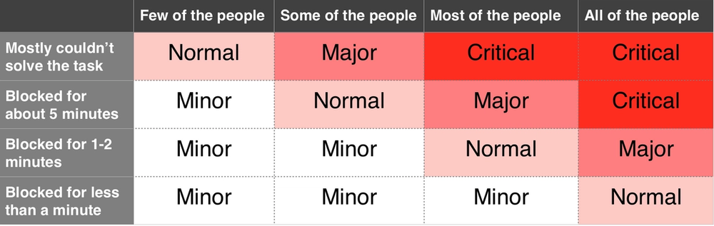
Issues
Installation Issues
Major
- It is not clear if the password strength box is a list of suggestions or mandatory.
Normal
- High percentage of the users haven't noticed the password strength box, just scrolled over to the next field.
- User complained that the system let him to set a weak password as an admin.
Minor
- The yellow after-installation instruction is incomprehensible for most of the users.
- People don't really understand what is the "Advanced" subtab is good for.
- The loading indicator at the installation showed 100% when the process haven't been finished.
- "Why is my password weak? It is usually strong on other websites"
- People complained that they couldn't find an option to see the exact process (like a terminal).
- People tried to navigate with the side-bar to the previous steps.
- It is not clear, that the site name will appear on the theme after installation.
Content Issues
Critical
- "Article is a content type". So many people added a new content type and they didn't understand why it's not visible on the front page.
Major
- "What is the difference between an article and a basic page?" The help texts were not so helpful.
Normal
- After the user created the first article to the site from the main page, he was confused how to create another one, because he couldn't find that button anymore.
- People only realized that the alternate text is a mandatory to the images when they tried to publish the article.
- Resizing an image was also a confusing task, most of the people wanted to see around the image adding button.
- People are trying to put the basic page to the main navigation from the right sidebar near to the WYSIWYG editor.
Minor
- "What is the difference between manage form display and manage display?"
- When a dropdown opens with suggestions or previous contents it is impossible to click on them,
- "What is caption means in this case?" Many of the participants searched for some help.
- "Which box should I use? The top one (WYSIWYG) or the bottom (under the WYSIWYG editor)".
Content Type Issues
Normal
- "The article length settings must be in the configuration, like the other settings."
- Because the article is visible on the frontpage, people expected to change their attributes from the "appearance" menu.
Minor
- Article was understood as a block and some of the participants wanted to change the article length in the block menu.
- Few participant wanted to edit the article length right from the editor (WYSIWYG's right sidebar)
- After setting the teaser's length to default, users got confused why the "read more" button is still on the frontpage.
UI Issues
Critical
- There were many situations when the participant found the right answer for his issue (a step by step tutorial) but because of the UI element issues, can't pass it.
Major
- The dropdown options on different buttons are almost invisible, just only a few users opened it.
- The subtabs are looks like just texts, especially when there are a classic tab navigation around it.
- There is no visible difference between the front page and the article page and in few situations it caused some misunderstandings.
- There are some misused UI elements on different pages. E.g: users searched for an upload image button and not a "used default logo" checkbox when they wanted to change the site icon.
Normal
- The 3 admin menu after the installation shocked the user. They needed a few minutes to understand which menu is for what type of actions.
- The hover edit option was mostly discovered accidentally on the front page.
- The edit button on different blocks shows different options and it confused the users.
- The UI elements are sometimes not consistent, e.g: most of the CTA buttons are blue, except the "place block" button, which is grey.
Minor
- A few people started to fill the search fields and click on the blue CTA (e.g. add user).
- The green success feedback banner is not disappearing after time, and people thought that it is an automatic autosaving.
- Some popup boxes have a horizontally splitted text line at the bottom. UI bug
Appearance Issues
Normal
- People didn't know what "Bartik" title means on the "Appearance" page.
- People didn't know what "Seven" title means on the "Appearance" page.
Menu Issues
Critical
- People tried to first create a link (for the menu) and after it the connected article. Unfortunately drupal works in the opposite way.
Major
- "Why do I have to know the link ??" Users thought they have to know the page's exact link to connect it.
Normal
- Nobody understood why nothing is happening after clicking repeatedly to the circle in the right side of the link field.
- People got confused, when they tried to add a menu to the frontpage and saw the "enabled" checkbox checked in. "it makes no sense"
Minor
- When people tried to create a link to the frontpage, they didn't know what is the dropdown with "parent link" text for.
- If the user duplicates a link it hard to decide which was the first.
Help Issues
Major
- "This page is useless, I can't find anything here!" User tried to find a solution for his problem, but after 5 minutes still haven't found anything.
Normal
- People get confused and left the page because of the "too much text". "I don't have time to read this"
- After opening the help page, users immediately changed it to Google.
Only 20% of the users opened the help page, others started with Google. - Users are looking for a Google style search on the help page, because they don't know what is their problem.
Taxonomy Issues
Critical
- After the installation, the users got stuck because Drupal's taxonomy, they didn't knew where to find what.
- People don't understand the "slogan" and they can't predict what will change.
Major
- People got confused after reading the different region names when they tried to add a new block.
Normal
- "Is basic page = landing page?" User asked when tried to add a new block.
- Blocks were understood as plugins.
- People don't understand the "weight" and what it is good for.
Minor
- "It is confusing, that the system calls the users sometimes "People", and sometimes "Users". What is the difference?"
Block Issues
Critical
- The "visibility box" only confused the users, because it worked in the opposite way, than they expected.
Major
- People don't understand what is the "visibility box" good for, and why is it highlighted.
Normal
- Blocks were understood as content, so they tried to add a new one as it would be an article.
- "Sidebar second is under sidebar first" People only read the list, but don't really know where they place the blocks.
- Some users tried to find the blocks in the "Appearance" menu, because "it is visible on the website, so it must be here".
- The "Block regions" page is not helpful for the users, still have no idea, which region is good for them.
Site Information Issues
Major
- After changing the site name on the site information page, user wonderred why it's not changed on the front page.
- People want to edit the description from the main page by editing the block (still couldn't find the howto).
Normal
- "The name, title and the logo should be in the appearance, like in other systems"
Minor
- Site description was understood as a content, and most of the people started the searching in the content menu.
- "Site description = account settings" Another misunderstanding about drupal compared with other similar systems.
We then compared our results with the test's results from 2015. There were obvious matches:
- In general, terminology of Drupal is confusing.
- Where to search for information and how to find it?
- Content creation after creating the first content item.
- What's the difference between manage form and manage form display?
- The 'Edit' button shows different options on different blocks, it's confusing.
- Order of creating links in main navigation and connecting it to pages.
- Is Basic page a landing/the front page?
- How does 'weight' work and what is the logic behind it?
These are just some highlights, but there were a lot of other items on our lists that appeared in the original test results as well and covered a similar area of Drupal. We also found a lot of issues not previously documented, which is not a surprise, as the tasks were not the same in the two tests.
What are the next steps?
A website dedicated to Drupal UX was launched recently. Various ways to join the initiative are mentioned on the front page of the site, and we're going to join the discussion to figure out how we can take part in planning and the implementation. We will suggest creating a UX research template with suggestions that help unify the main research. We would also like, with the help of the community, to find solutions to the problems discovered during our own research and create issues for the problems, a was the case with the Minnesota research.
It’s wonderful that we can take part in the contribution in this way as well, and I am excited to see what results will we get within the next few months, as the solution to this complex problem is long awaited.
I want to encourage everyone interested in the process and the results to join the communication channels mentioned on drupalux.org, and take part in building Drupal and making it better, so anybody who joins the Drupal community can have a system that is enjoyable to use and improve.
Sidenote:
Andor Dávid, our lead Drupal developer, also deserves a huge shout-out, as he took part in figuring out the test tasks, and he also presented the correct solution of solving them to Ákos Fülöp, the conductor of the tests. I am also very grateful for my colleagues’ limitless patience for taking part in the research as test subjects.
Related posts


We've decided to rewrite our corporate intranet using a decoupled architecture instead of porting it directly to Drupal 8 as is.

As part of Design Week Budapest, we had two workshops about Experience Design: what it is, why it’s important and how it’s used.
According to our experience the most usual approach for clients with web development needs is to contact multiple agencies with more or less vague ideas - asking for quotes, and then selecting a choice based on price. This approach is doomed to fail for two reasons.